


FashionGo Dropshipping Mobile is everything you need to run your dropshipping business from your pocket. We created a mobile-friendly application that can be downloaded on iOS and Android devices so our users can run their businesses on the go.

Overview
After launching the FashionGo Dropshipping app on the desktop platform, we wanted to further enhance our user's experience on our app by creating a mobile-focused interaction and layout. We had thousands of users who signed up, and several of them complained about the accessibility of our app on the mobile platform. As we gathered user traffic from our platform, we found out more than 67% of our users were using the mobile platform.
I led the design and build of the FashionGo mobile and web apps from the ground up and worked with the team to help shape a mobile-friendly dropshipping experience. FashionGo Dropshipping Mobile is an app our users can download from the Apple App Store or Google Play
My Role
UX Designer
Duration
Feb 2021 - Aug 2023
Tools
Figma, Photoshop, Illustrator, Dooray, Invision, Overflow


Sign Up or Login
User can login, sign up, or browse as a guest. Users can use their FashionGo Whole account to access FashionGo Dropshipping. Or create a new account for free.
Find Products
Users can browse through thousands of products supplied by our trusted vendors and list them on their Shopify store with a single click!


Add to Favorites
Users can save the items they like in the Favorite folders before syncing them to their Shopify store. Users can create multiple folders to better organize their saved items.
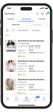
Sync to Store
Users can easily sync the items they like to sell directly to their Shopify store. Users can log into either FashionGo Dropshipping or their Shopify store to further manage their products, such as product name, price, image, etc.


Fulfill Orders
Users can set up the AutoPay feature to conveniently fulfill orders coming in from Shopify automatically.


Hover for audio


Manage Account
Users can go to Store Settings to connect their Shopify store, change product pricing rules, setup AutoPay, or adjust other settings.
Guided On-boarding
Many users were still unsure about the concept of dropshipping business. So we decided to add a simple but intuitive way to explain dropshipping and our application to our users.


App Design Process
The Process
Our process at FashionGo Dropshipping is based on the Double Diamond Theory and Lean UX process. We were very fortunate to have a list of vendors who wanted to be part of our user research process. I led our UX team to interview several of our users to discover user pain points and test our assumptions.

Product Vision and Solution
Our goal is clear: to be the market leader by offering unparalleled convenience and user-friendliness for on-the-go entrepreneurs. I spearheaded the creation of a cutting-edge mobile application poised to redefine the dropshipping landscape. In close collaboration with active users from our desktop platform, my focus has been on developing a mobile solution that centers around their needs. By leveraging their valuable insights, I've played a pivotal role in crafting an app that not only meets but exceeds expectations, setting a new standard for dropshipping efficiency.
Research
After collecting the recordings from the user interviews, I conducted affinity mapping with my teammate to synthesise the pains identified. We grouped these problems under common themes and features in the platform.
I relied on a data-driven approach known as the severity framework to inform my process and list usability issues in order of priority. The framework helps to identify the severity score of a usability issue based on the following three variables:
Task criticality x impact x frequency = severity
-
Task criticality - how important is the task to the user? (1 = low, 5 = critical)
-
Impact - how much of an impact does this issue have on the user's task? (1 = suggestion, 5 = blocker)
-
Frequency (%) - how many times does this come up out of total participants?

Benchmarking & Competitive Analysis
I started extensive research on the trending mobile e-commerce UX and interactions. After going through numerous mobile platforms and analyzing the pros and cons of each layout and interaction, I was able to select the most fitting layouts and interactions for our mobile application.


Narrowing down the scope of work
Based on the interviews with our users and analyzing the heuristic evaluations, it was revealed that there were commonalities in the product vision. We identified the following key user stories:
-
Edit in Shopify. Users do not usually edit in the dropshipping platform, they like to Sync the product to Shopify first, and then edit product information such as name, description, price, tags, collections, etc.
-
Organize by Collections. Users have more than 100 collection folders on average. Users needed a function that allowed them to group items to organize them better.
-
Replace the Import List. We discovered that users do not need the import list page before syncing the items to Shopify. It was an unnecessary step that most users skipped before syncing to Shopify.
-
Auto calculate Profit. An important number for our user was their profit margin after product cost and shipping cost were added.
-
Use bulk tags. Users use the same set of tags for similar items.
-
Favorite items. Users want to save some of their items in a separate folder before syncing them to Shopify.
-
Display Shopify Icon. Users desired more clear way of showing the items that are already Synced to Shopify.
Wireframing
Based on the above problems identified, I worked towards addressing these pains by coming up with potential solutions:
-
Reducing the number of steps to sync products to Shopify
-
Surfacing important elements and enabling the Primary buttons to show clear functions
-
Establishing a clearer visual hierarchy by grouping related elements
I quickly mocked up some basic wireframes to gather feedback from my UX team, Product Managers, Developers, COO, and the users on the overall layout and structure of the mobile designs. This involved establishing a standardized visual hierarchy and layout for the future pages and components.
Design Exploration
I explored many different design options as I started designing the application. I started with researching current dropshipping competitor’s layouts and interactions. Then I created wireframes for internal teams meeting with Project Managers, UX team, Dev team, and COO. We originally benchmarked the standard dropshpping process of finding products, importing, and then syncing to shopify. But as we discovered better task flow through user interviews, I quickly redesign our application’s core functions, task flow, and interactions.


Validating the designs
I conducted usability testing sessions with our primary users to validate whether the new designs would solve their problems. I wrote a script including a scenario asking the user to create a new Audience targeting females of all ages on mobile devices with manual bidding enabled.
During the session, I observed how they interacted with the prototype and set up the Audience. The usability session revealed that it was less arduous to set up a new Audience due to the grouping of related fields. It was easier for the user to identify which forms they had to fill, as advanced settings were now hidden under a collapsable toggle.
Major Improvement 1
As a new dropshipping company we benchmarked the leading dropshipping platform's standards. Most of our competitors had a universal user task flow of Find Products > Import List > Product List (Shopify). However as we interviewed our users, we were able to discover that import list was not a necessary step for most of our users. We identified that most users like to sync the product to Shopify first and then edit the product details there. There was also feedback from the users stating that having 1 import list was not helpful when it came to organizing and managing their products.
So our team went back to the drawing board and explored some other options to enhance the user experience. And I came up with a solution that changed the direction of our app completely. We immediately got rid of the import list and replaced it with Favorite folders. And we also allow users to directly sync items from Find Products page to Shopify.
After we presented our solutions to our selected users, we received very positive feedback and they were excited to see a new way of using our application.

Major Improvement 2
Another big improvement we made was to make the order checkout process automatic for our users. When our user (dropshipper) receives an order from their customers, they need to send this information and pay the supplier so the item is shipped out to the end customer. Most platforms we researched made this checkout process to be confirmed and paid manually by their users. Initially, we believed that this process was designed this way in case of a false transaction. But when we later spoke with our users, we realized it was a point they did not care about at all. They would rather have it checked out automatically unless there is an issue with the order or payment. We identified that the most commonly occurring issues can be: expired cards, not enough balance, unrecognized shipping addresses, or items being out of stock.
So our team went back to the drawing board and explored some other options to enhance the order processing experience. And I came up with a solution to have the order be checked out automatically with a warning system in place, where we halt the order from being checked out if any of the common issues we identified is noticed by the system. We also gave three options for our users to choose for checkout delay time (immediate, 24hr delay, 48hr delay).

Major Improvement 3
As we continued to research our users' behavior and ran several heuristic evaluations, we noticed that the notifications that are sent to users are usually from our FashionGo system as an announcement or from suppliers of the items they chose to list on their online store.
The most common alerts are out-of-stock, low stock, price change, new variants, etc. With this in mind, we realized the most important thing in these types of notifications is not just to alert the user but to allow the user to gain value from these notification patterns.
For example, we noticed that certain suppliers are very responsive and quick with their product updates while other suppliers might not be. Also, some of our users like to select items from their trusted vendors, so they will only list items from these suppliers to their online store.
So instead of having 1 notification page that has all types of alerts in one place. We decided to send notifications through a chat room. So the user and supplier can build relationships and trust more easily as their notification history is left in the chat room.

Developing the designs
I created my high-fidelity mockups in Figma and also created sample prototypes in Invision to share the interaction I was visioning with the developers.
I worked very closely with the Development team and Project managers to spec out any missing pages or interactions that were not covered in the high-fidelity mockups. I conducted a UX review of each front-end ticket that was implemented to ensure it was aligned with the designs before it went live. After the beta launch, I followed up with the Dev and QA teams to continuously find any issues with the application or find any opportunity for improvement.
Results and takeaways
Since the launch of the FasionGo Dropshipping Mobile App, we have seen a significant decrease in the number of complaints lodged through the service desk. Additionally, we have received positive feedback from users on our review pages on the Shopify App Store, Apple App store, and Google Play Store.
Some key takeaways from this project are:
-
Create a strategic plan to launch an MVP (Beta version of the app). This helps deal with out-of-scope requests that could potentially derail the project and helps deliver a quality product on time.
-
User testing doesn't end after development. Design is a constant iteration of improving the experience for the end user. Always find ways to collect and listen to your user's feedback.
-
Involve engineering upfront. During the design stage of the app, we invited many developers to our meetings to discuss our design direction. This helps to reduce any rework later on as an understanding of the technical limitations upfront will help to inform your design strategy.
-
Time limitation and expectation management. After the beta launch, we prioritized which parts of the app would be updated first and broke it down into multiple development phases. This helped us to hit our goals on tight development time, and manage our expectations of success with different metrics for each phase of development.


Checkout our FashionGo Dropshipping app on the Apple App Store, Google Play, and Shopify App Store.


<Mobile>

<Tablet>


Checkout our FashionGo Dropshipping app on the Apple App Store, Google Play, and Shopify App Store.
